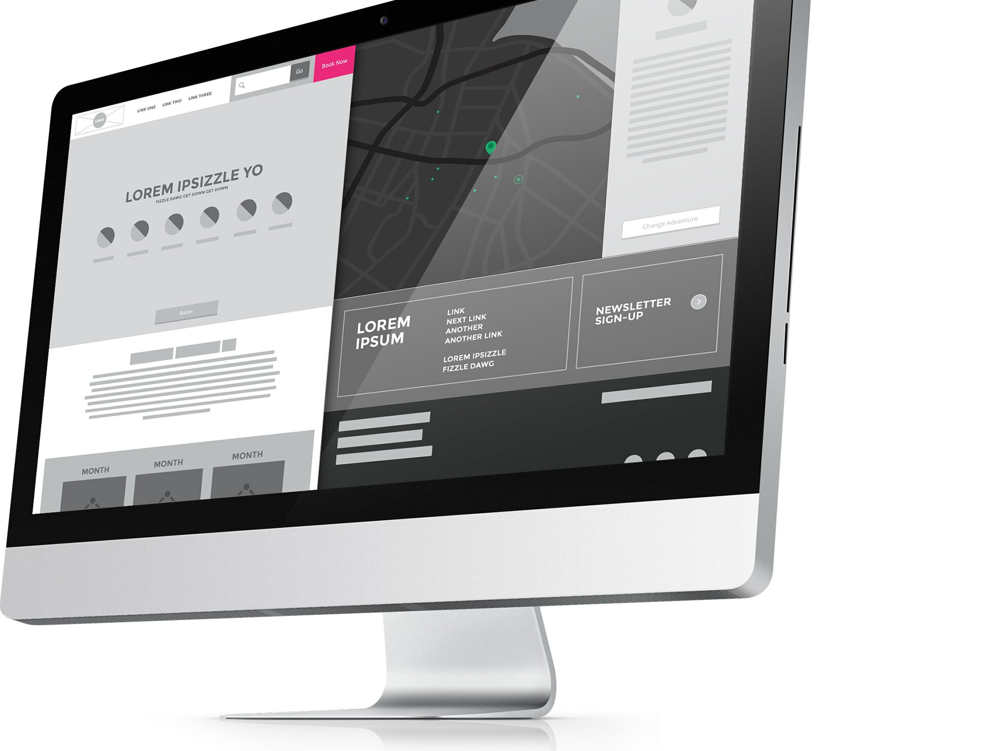
Wireframe Kit
I used to approach wireframes like everyone else; boxes with labels on them. They provided limited insight or vision, and clients didn't understand them. As a result, ideas were lost, and a gap was forming in the earliest stages of the project. What I thought were clear wireframes, were just boxes. I'm realizing that some clients need visual cues to help them interpret this bare bones approach to organizing content. But, the challenge lies in steering clear of establishing a look and feel to retain the flexibility needed in the design stages.

Visual Cues
Providing visual cues that can help a client see how you're envisioning their product is a link that is often missed by interface designers. For a client, a 1px stroked box, with the words "PHOTO W/ ROLLOVER TEXT" in it, often can't be translated into your vision of the final product, or even content structure.

A slick interface activated by icons (shown at top), can't be understood through boxes. A simple two-tone circle is the perfect upgrade.
Vector Based
I use Illustrator for all my wireframes. This wasn't always the case though. The more I got annoyed with the limits of wireframe software, the more I started creating elements piece-by-piece. Now that i've established a decent library, it's a simple drag of elements to test new interfaces. Apps like Sketch and Axure are doing really cool stuff, but at the moment, they don't fit my work flow like Illustrator and InDesign. I'm constantly looking for that program that can do it all. Maybe Sketch will eventually.
Taking this approach has not only bridged some gaps for the client, but it has allowed me to start testing interfaces earlier and at a faster rate.
Hey good lookin'
So if you're digging this kit and want to start using it, then download and get going. I'll keep updating the kit as I create new elements, and i'm down to include elements you make as well. So give me a holler on or if you want to add to it. And let me know if this approach is helping or hurting.

Pick Your Detail
One thing I would advise is, use caution with the amount of detail you put into a wireframe. You can easily get caught up in it, and produce a wireframe that feels like a design. Limit the visual cues to the elements that need to be more explicit.